
A Pantone code gives drinkware manufacturers a standardized color target, but it does not guarantee that every finished component will look identical under all conditions.
On custom stainless steel tumblers, water bottles and coffee mugs, the final color can be affected by:
- Product material
- Coating formulation
- Coating thickness
- Surface texture
- Matte or gloss level
- Curing conditions
- Product shape
- Lighting
- Manufacturing process
For B2B buyers, the practical question is therefore not simply:
“Can you match Pantone 306 C?”
A better question is:
“Which physical reference will be used to approve the color, what variation is acceptable, and how will the factory control it during mass production and repeat orders?”
Quick Answer: Can the Same Pantone Color Look Different on Different Materials?
Yes. The same Pantone reference can look noticeably different when applied to powder-coated stainless steel, injection-molded plastic and printed paper packaging.
For example, a tumbler body, plastic lid and retail box may all specify the same Pantone color without appearing visually identical. These materials have different surface textures, gloss levels, light-reflection characteristics and production processes.
Therefore:
Using the same Pantone number on stainless steel, plastic and paper does not guarantee an identical finished appearance.
For multi-material drinkware projects, buyers should approve the complete assembled product and its packaging. If closer visual coordination is required, different material-specific color formulations may be needed.
Pantone also explains that color appearance can change according to the material on which it is produced, and some colors may not be equally achievable on every material. See Pantone’s explanation of color systems and material differences.
Key Findings for Drinkware Buyers
- A Pantone number is a starting reference, not always the final production acceptance standard.
- The same Pantone color may look different on stainless steel, plastic and paper packaging.
- Matte, gloss, soft-touch, metallic and textured finishes reflect light differently.
- A physical sample on the actual product is more reliable than a screen image.
- Buyers should approve the assembled bottle, lid, handle, logo and packaging together.
- The approved physical sample should become the master reference for mass production.
- For brand-critical colors, instrumental measurement such as ΔE can support visual inspection.
- Color tolerance and inspection conditions should be agreed before production begins.
Why Does the Same Pantone Color Look Different on Drinkware?
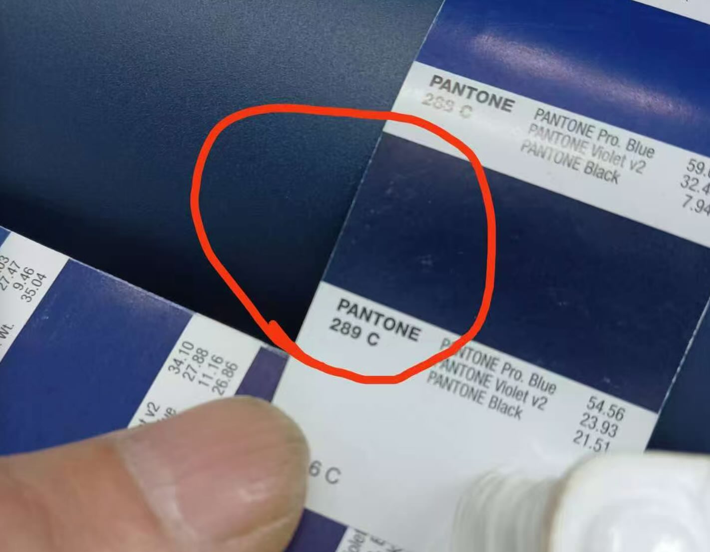
A Pantone card is a standardized reference, but a finished tumbler is a curved, coated product rather than a flat printed card.
| Factor | Possible effect |
|---|---|
| Substrate | Stainless steel, plastic and paper reflect or absorb light differently |
| Coating formulation | Pigment formulation can affect hue and saturation |
| Coating thickness | May change opacity and visual depth |
| Matte or gloss level | Changes how strongly the surface reflects light |
| Surface texture | Can make the color appear softer, darker or less saturated |
| Curing conditions | Temperature and time may influence the coating |
| Product shape | Curved surfaces create highlights and shadows |
| Lighting | Colors may change under daylight, retail and office lighting |
| Manufacturing process | Powder coating, plastic molding and printing produce color differently |
This is why a color should ideally be approved on the actual material, surface finish and product shape used for production.
Why Can the Bottle, Lid and Packaging Look Different?
A custom drinkware program may use the same brand color on several components:
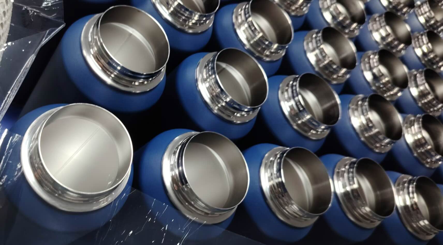
- Bottle body: powder-coated stainless steel
- Lid or handle: injection-molded PP, Tritan or another polymer
- Retail box: ink printed on coated or uncoated paperboard
These components use different pigments, processes and surfaces.
Plastic may have a different gloss level from powder-coated metal. Paper can absorb ink, while a coated metal surface reflects more light. Even coated and uncoated paper can produce visibly different results from the same Pantone reference, as explained in Pantone’s guide to coated and uncoated colors.
What should buyers do?
Approve the complete product rather than reviewing each part independently.
Place the bottle body, lid, handle and packaging together and ask:
- Do the colors look visually coordinated?
- Is the difference acceptable for the brand?
- Are the finishes equally matte or glossy?
- Does the logo still have sufficient contrast?
- Does the product look consistent under agreed lighting?
What can the manufacturer correct?
If the components do not look coordinated, the manufacturer may need to adjust:
- Powder-coating formulation
- Plastic masterbatch color
- Gloss or matte level
- Coating thickness
- Printed ink formulation
- Packaging paper or surface coating
The objective is visual harmony across the finished product—not necessarily an identical pigment formula on every material.
Pantone Reference vs. Approved Master Sample
One of the most important purchasing decisions is defining which reference will control mass production.
A practical workflow is:
Pantone Reference → Physical Color Sample → Buyer Approval → Master Sample → Mass Production Inspection → Final QC
Step 1: Buyer provides the color specification
The specification should include:
- Pantone code
- Pantone system, where relevant
- Product model
- Component material
- Surface finish
- Matte or gloss requirement
A Pantone number without material and finish information is incomplete.
Step 2: Manufacturer prepares a physical sample
Whenever possible, the color should be applied to the actual product or a representative surface made using the intended production process.
Step 3: Buyer reviews color and finish together
Check:
- Hue
- Brightness
- Saturation
- Matte or gloss level
- Surface texture
- Logo contrast
- Coordination between body and lid
- Coordination between product and packaging
Step 4: Buyer approves a master sample
After approval, the physical sample becomes the primary visual reference for production.
Both parties should record which sample was approved, including the date, product model, finish and sample identification.
Step 5: Production is checked against the approved reference
Production pieces should be compared with the master sample during manufacturing and final inspection.
This is more practical than judging finished goods against the Pantone number alone.
What Is ΔE in Drinkware Color Control?
ΔE, or Delta E, is a numerical measurement of the difference between two colors.
In general:
Lower ΔE = smaller measured color difference.
However, there is no single ΔE tolerance that should automatically be used for every custom drinkware project.
The appropriate tolerance can depend on:
- Coating system
- Surface texture
- Matte or gloss finish
- Metallic or pearl effect
- Product geometry
- Brand requirements
- Measuring instrument
- Measurement position
- Lighting and observation conditions
A smooth, standard powder-coated bottle is generally easier to measure consistently than a curved metallic, glitter or textured surface.
For brand-critical projects, the buyer and manufacturer should agree on the measurement method and acceptable tolerance during sampling—not after mass production.
Instrumental measurement should support, rather than automatically replace, visual approval of the assembled product.
Which Drinkware Finishes Are Harder to Match?
Standard powder coating
Commonly used on stainless steel tumblers and bottles. It is generally suitable for custom colors, although physical sample approval is still recommended.
Matte finish
Matte surfaces diffuse light and may make a color appear softer or lighter.
Gloss finish
Stronger reflection can make a color appear darker or more saturated depending on the viewing angle.
Rubberized or soft-touch finish
Surface texture changes light reflection and can affect perceived color depth.
Metallic or pearl finish
Metallic particles make color appearance dependent on lighting and viewing angle. A single Pantone number may not fully define the finished effect.
Gradient and special-effect finishes
Gradient, glitter, iridescent and other decorative finishes should be approved using physical samples because their appearance cannot be controlled by one flat color reference.
Buyers can review these options through TOPNOVO’s drinkware customization and surface-finishing capabilities.
Common Color Problems and Corrective Actions
| Observed problem | Likely cause | Buyer check | Manufacturer action |
|---|---|---|---|
| Color appears too dark | Formulation, thickness or gloss | Compare with the master sample | Adjust formula or application |
| Color appears too light | Coverage or formulation | Check opacity and coating consistency | Improve coverage or pigment balance |
| Body and lid do not match | Different materials and processes | Review the assembled product | Adjust metal and plastic colors separately |
| Packaging looks different | Paper and printing process | Compare box with the actual product | Adjust ink or paper specification |
| Gloss varies across units | Application or curing variation | Inspect units from different cartons | Control coating and curing parameters |
| Color changes under lighting | Metamerism | Compare under agreed light sources | Define inspection lighting |
| Repeat order looks different | Batch or process variation | Compare with previous production | Use retained samples and production records |
A visible difference does not always mean that the Pantone number is wrong. The material, finish, lighting or production method may be responsible.
What Should Buyers Approve Before Mass Production?
Before approving a custom drinkware color, confirm:
- Pantone reference
- Pantone system, where applicable
- Actual product material
- Coating or coloring process
- Surface texture
- Matte or gloss level
- Physical product sample
- Bottle, lid and handle combination
- Logo color and contrast
- Packaging color
- Acceptable visual variation
- ΔE requirement, if needed
- Inspection lighting or measurement conditions
- Approved master sample
- Repeat-order reference
The most important rule is:
Do not wait until finished goods are produced to define what “acceptable color” means.
Color acceptance should be agreed during sample development.
For the broader approval process, see how to test insulated drinkware before bulk production.
How Can Brands Improve Repeat-Order Color Consistency?
Repeat orders can vary because of changes in:
- Coating-material batches
- Pigment batches
- Equipment settings
- Curing conditions
- Plastic masterbatch
- Packaging ink
- Surface preparation
- Production environment
Consistency can be improved by retaining:
Pantone reference + approved master sample + material and coating specification + production records
When placing a repeat order, buyers should identify the previous order and confirm whether the new production must match the retained master sample or the last approved production batch.
TOPNOVO’s drinkware quality control process explains how approved specifications are carried from pre-production through manufacturing and final inspection.
Buyer Decision Guide
| Project type | Recommended color-control approach |
|---|---|
| Promotional or wholesale order | Pantone reference plus approved physical sample |
| Private-label retail product | Approve bottle, lid, finish, logo and packaging together |
| Brand-critical signature color | Agree on visual reference, ΔE and inspection conditions |
| Metallic or special-effect finish | Use the physical sample as the primary reference |
| Multi-material product | Adjust colors by material to achieve visual coordination |
| Repeat-order program | Retain master sample, specification and production records |
The right control level should reflect the brand requirement, product value, order quantity, development schedule and cost of a mismatch.
How TOPNOVO Controls Custom Drinkware Colors
For custom drinkware projects, TOPNOVO evaluates color together with:
- Product material
- Coating process
- Surface finish
- Lid and accessory materials
- Logo method
- Packaging
- Buyer approval requirements
A typical workflow is:
Pantone Reference → Custom Sample → Buyer Approval → Master Sample → Mass Production → Color and Finish Inspection → Final QC

Brands developing stainless steel tumblers can explore TOPNOVO’s custom stainless steel tumbler manufacturing capabilities, including custom colors, finishes, lids, logos and packaging.
FAQ
Can a manufacturer match a Pantone color exactly?
A manufacturer can target a Pantone reference, but the finished appearance may vary because of material, finish, coating, product shape and lighting. An approved physical sample is normally the more practical production reference.
Can stainless steel, plastic and packaging use the same Pantone color?
Yes, but they may not look identical. Powder-coated metal, molded plastic and printed paper require different production processes and may need separate color adjustments.
Why does a tumbler look different from the Pantone card?
A Pantone card is flat and printed on a defined substrate. A tumbler is curved and coated, producing different reflection, texture and visual depth.
What is an acceptable ΔE for custom drinkware?
There is no universal value for every project. Buyers and manufacturers should agree on the tolerance, measuring method, surface type and inspection conditions during sampling.
Should buyers approve color from a digital image?
No, not for final production approval. Screens, cameras and lighting can distort color. A physical sample made on the intended material is more reliable.
Can a repeat order match the first production?
Consistency can be improved by retaining the master sample, coating specification and production records. Some process variation may still occur, so the acceptance method should be confirmed before repeat production.
Need a Custom Pantone Color for Your Drinkware?
Send TOPNOVO your:
Product model · Pantone reference · Material · Surface finish · Logo method · Packaging · Order quantity
To receive an accurate initial evaluation, you can first prepare your custom drinkware RFQ.
If color is critical to your product, request a physical sample before mass production so you can approve the actual bottle, lid, finish, logo and packaging combination.
Request a Custom Drinkware Sample
Discuss Your Project and Get Pricing